The
Challenge
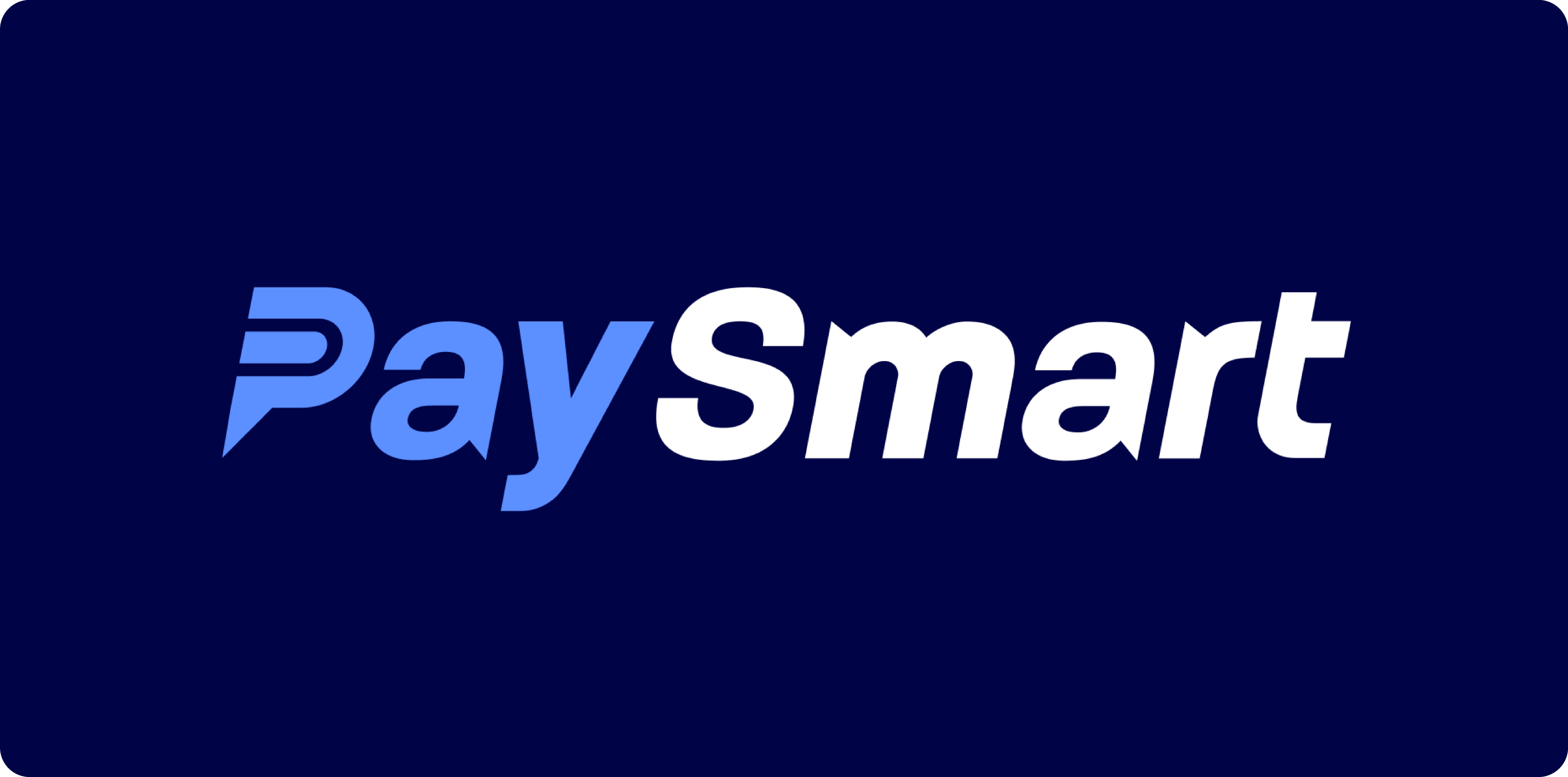
Core Identity
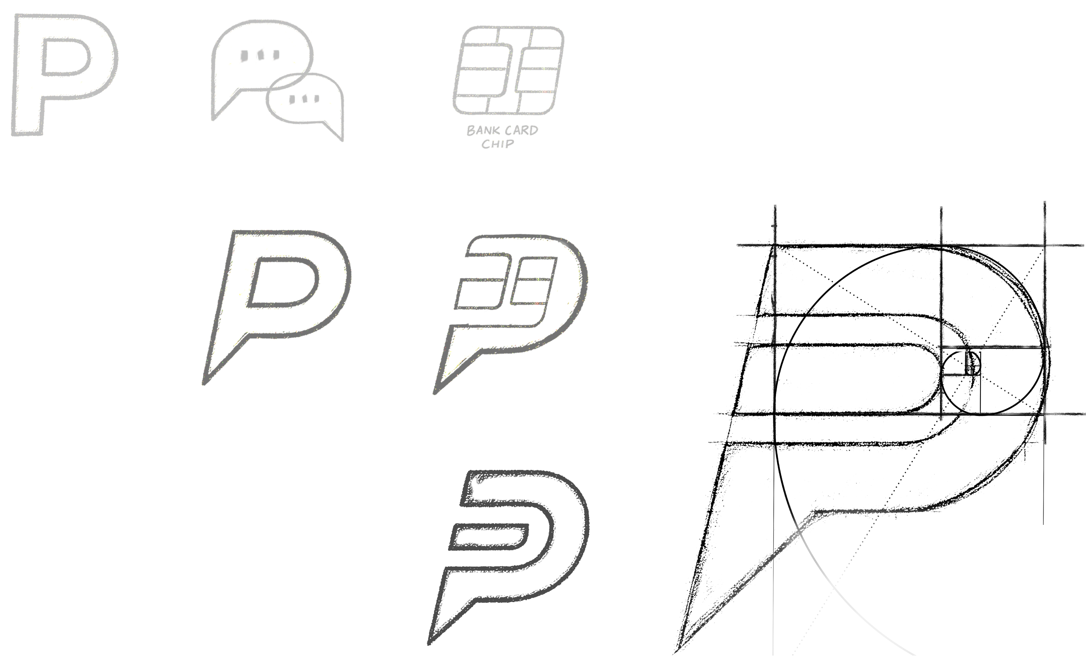
Concept & Icon
The “P” symbol pulls together two key ideas:
- Payments - horizontal lines reference tap-to-pay chips and transaction flow.
- People - the speech-bubble tail signals service, conversation, and client focus.
The negative space pulls it together - the point of recognition where tech meets service.
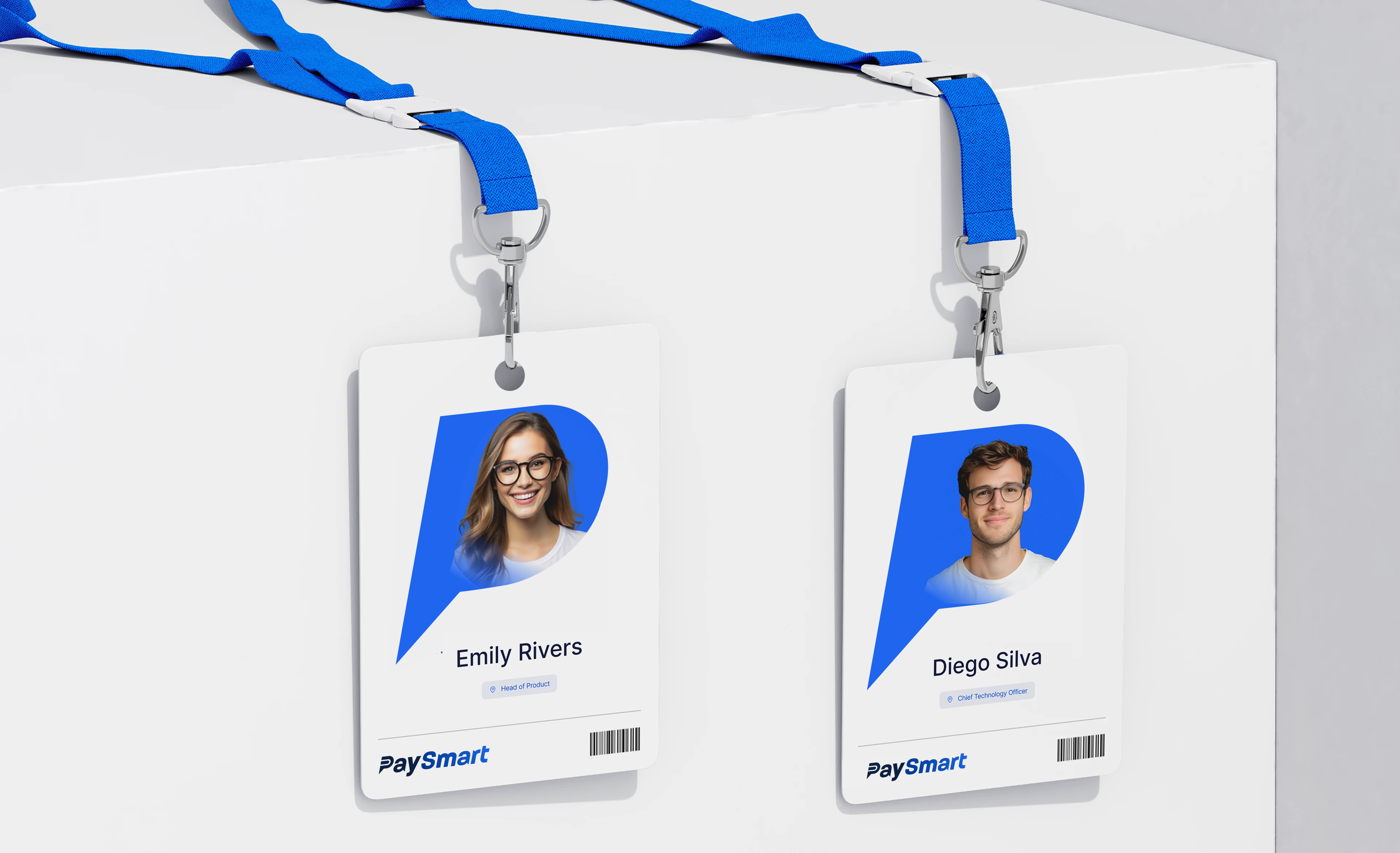
Built to be sharp at 16px, strong at 6ft, and equally at home in a mobile nav or on a printed invoice.
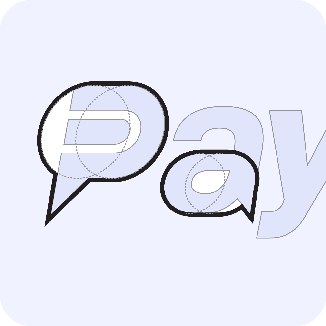
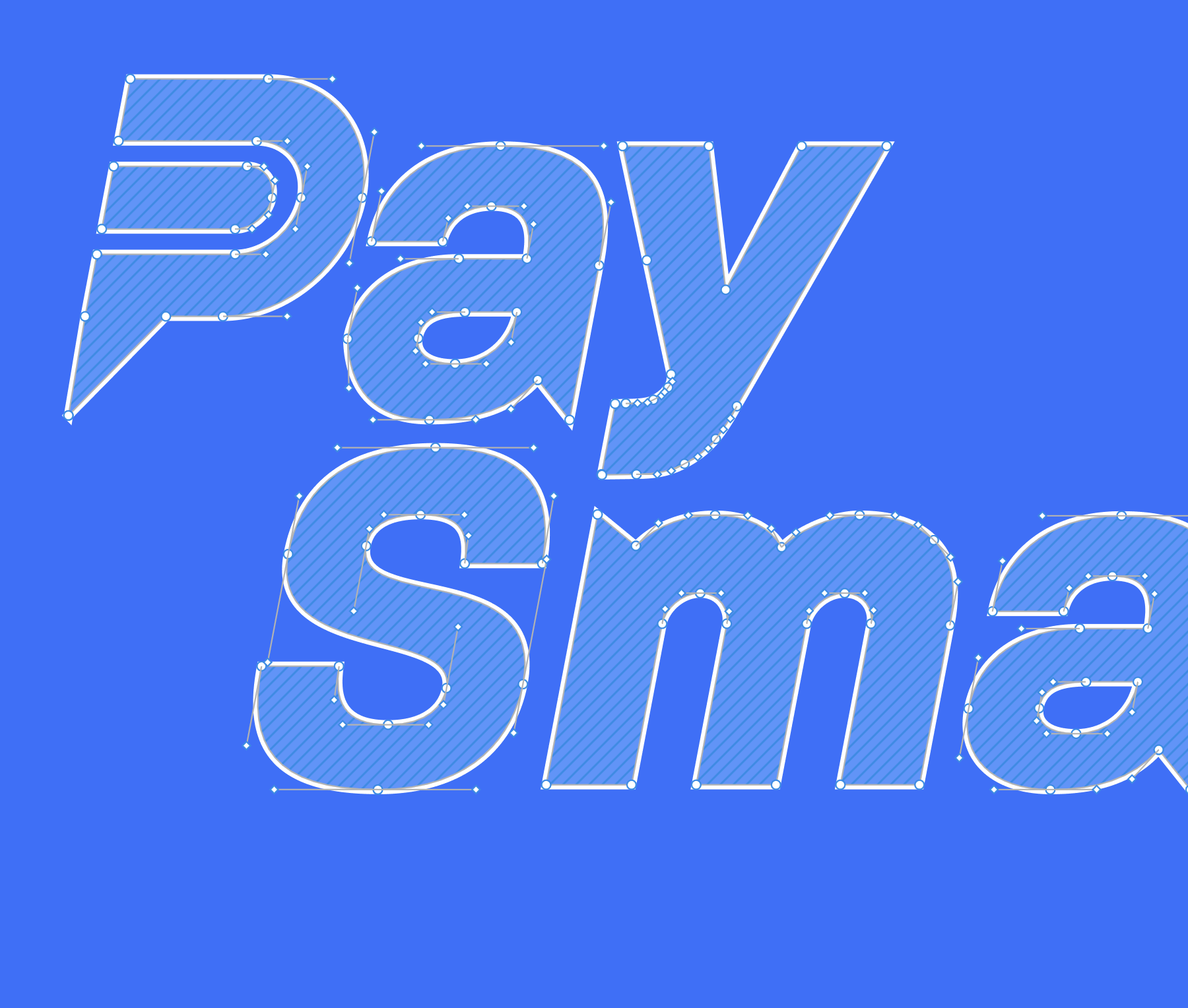
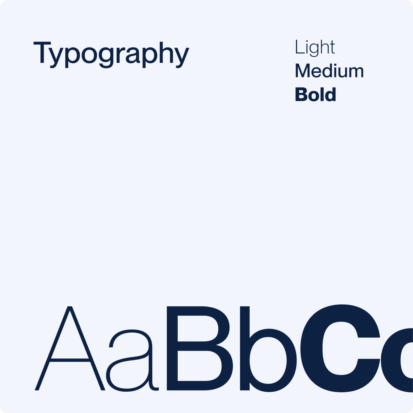
Logotype & Grid System
A custom sans-serif wordmark that walks the line between tech and human warmth:
- Rounded terminals soften the tone.
- Angular cuts and a forward lean add motion.
- Every proportion aligned to a strict geometric grid for balance and rhythm.
Colour & Typography
A custom sans-serif wordmark that walks the line between tech and human warmth:
- Rounded terminals soften the tone.
- Angular cuts and a forward lean add motion.
- Every proportion aligned to a strict geometric grid for balance and rhythm.
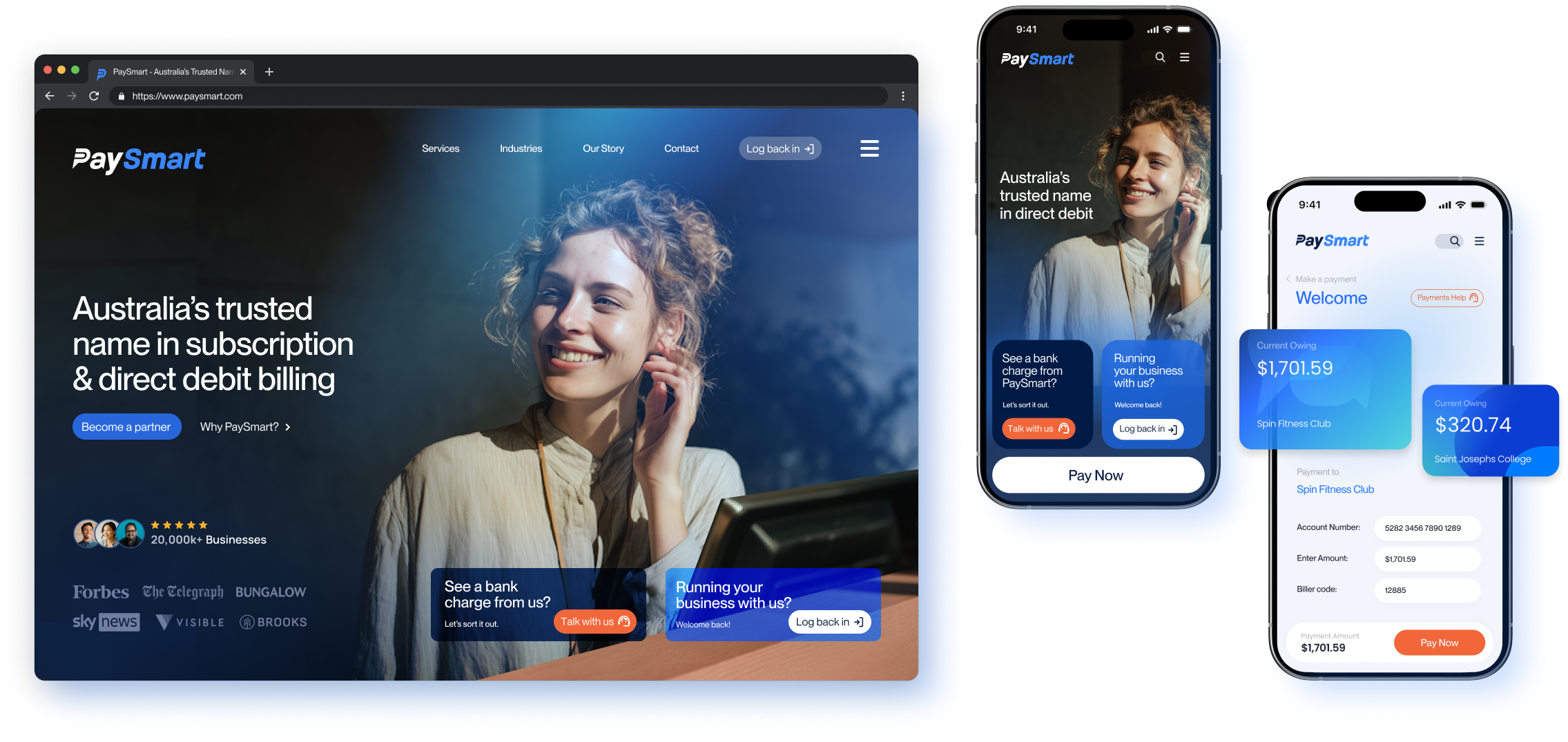
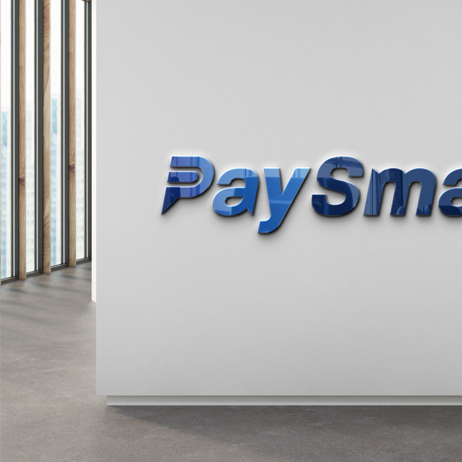
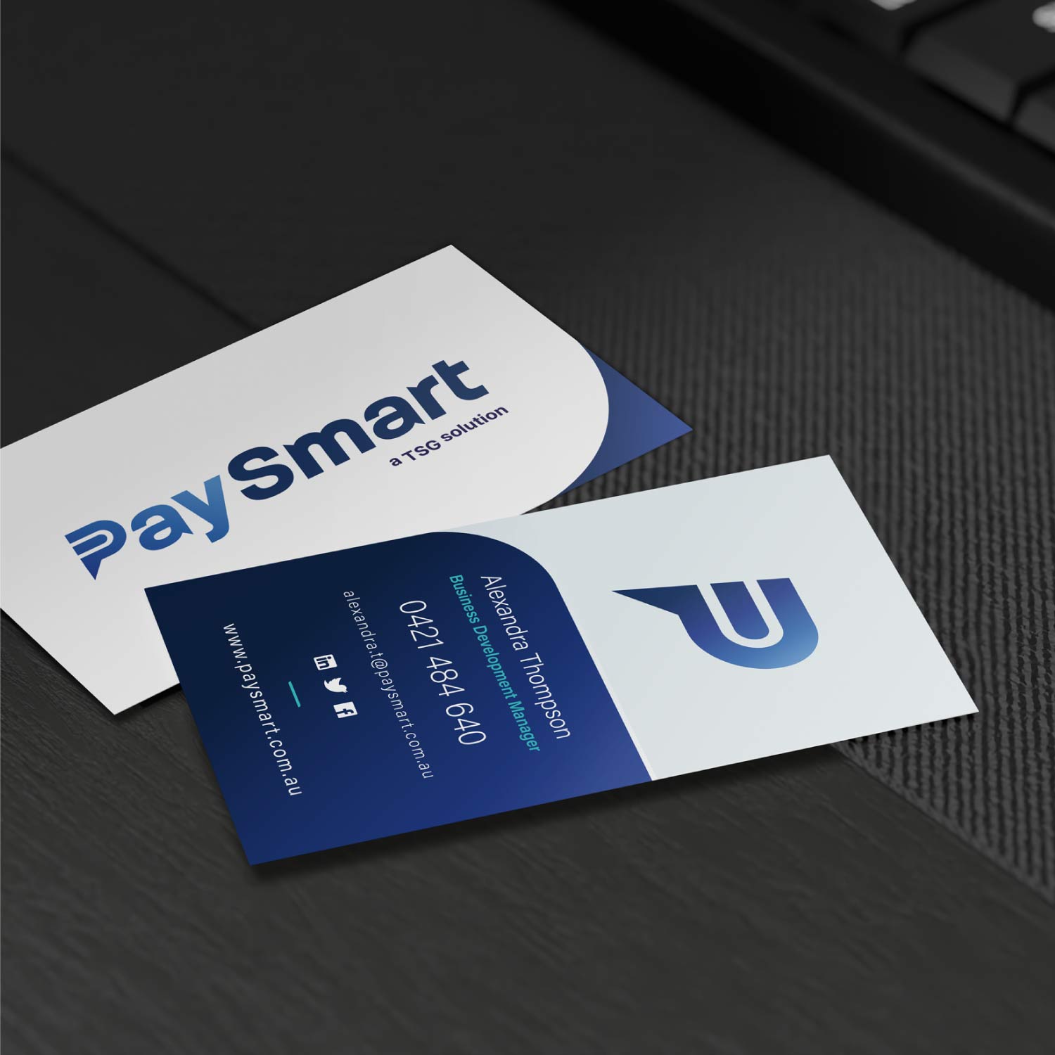
Rollout & Application
From responsive web to printed statements, the system was built to be modular and scalable:
- Social media templates that stay on brand without needing a designer on speed dial.
- UI kits and asset libraries for consistent digital execution.
- Print collateral, from client statements to event signage.
Typography
From grey, generic, and forgettable → to a sharp, scalable identity with meaning baked into every curve.
Application
From grey, generic, and forgettable → to a sharp, scalable identity with meaning baked into every curve.


.jpg)